Edit Elements
For all users
Updated Sep 2025
Your website is built from many different elements — text, images, buttons, and more. Each one can be customized to match your style and needs. With the Oniva.io editor, editing these elements is simple and intuitive: just hover over an element and click on it to start editing.
- The element type (for example, text shows a formatting toolbar, while images or buttons open the edit panel on the left).
This guide will walk you through how to edit each type of element and explain how editing works in both modes, so you can shape your website into something that truly feels yours.
Text Elements
Oniva.io supports the following text elements:
- Heading 1 (H1) – Main page title, used once per page for SEO.
- Heading 2 (H2) – Section titles.
- Heading 3 (H3) – Subsections inside a section.
- Heading 4 (H4) – Smaller subsections.
- Heading 5 (H5) – Minor headings, often used in cards or small highlights.
- Heading 6 (H6) – The smallest heading, often used for captions.
- Paragraph (P) – Regular text.
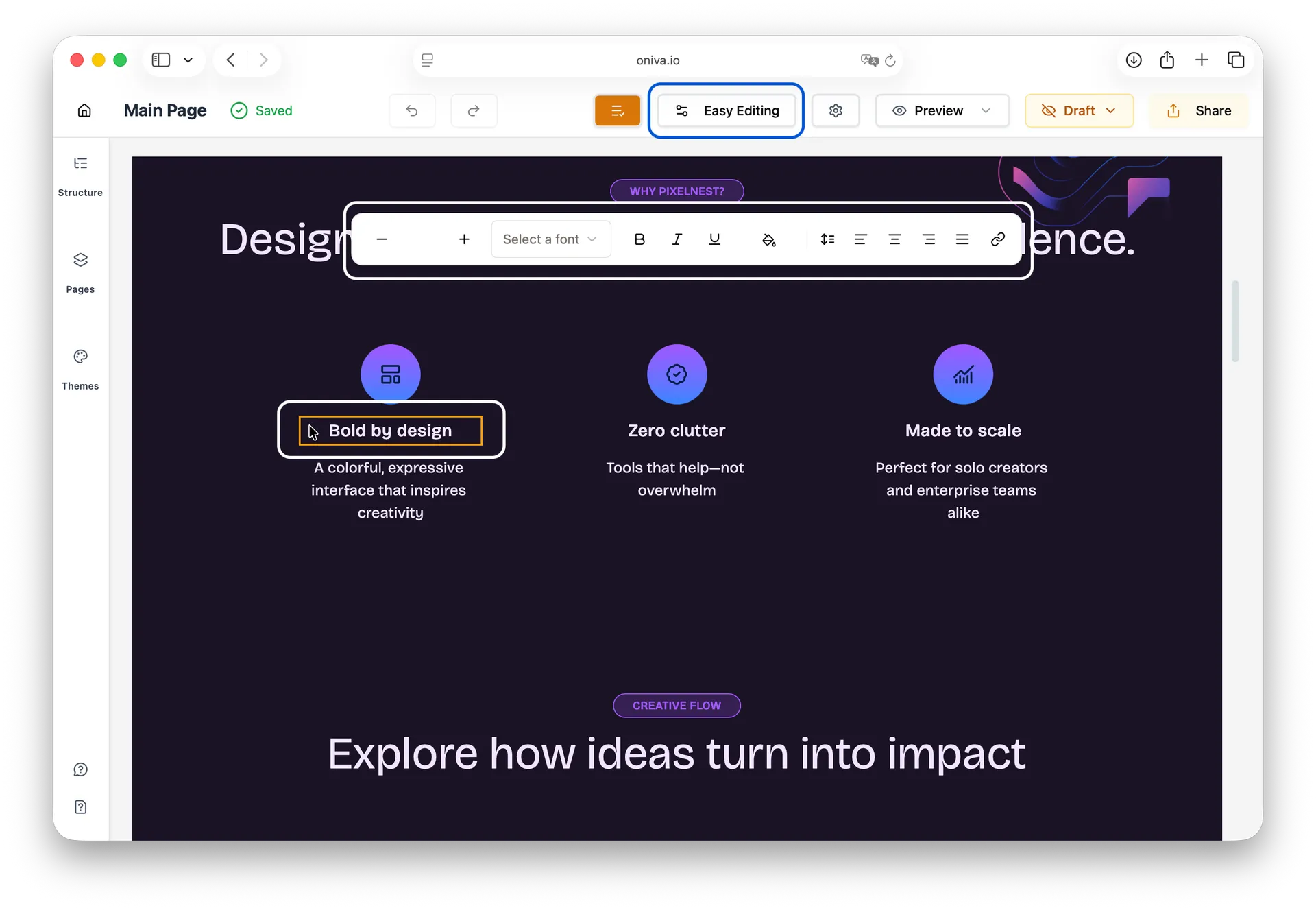
Easy Editing Mode:
How to edit:
1. Click on the text element
2. A toolbar appears above the text
3. Edit the text directly on screen
4. Use the toolbar to format (bold, italic, links, color, font, etc.)
Note: Text elements are the only elements that don't show a left sidebar in Easy Editing mode. You edit them inline with a floating toolbar.
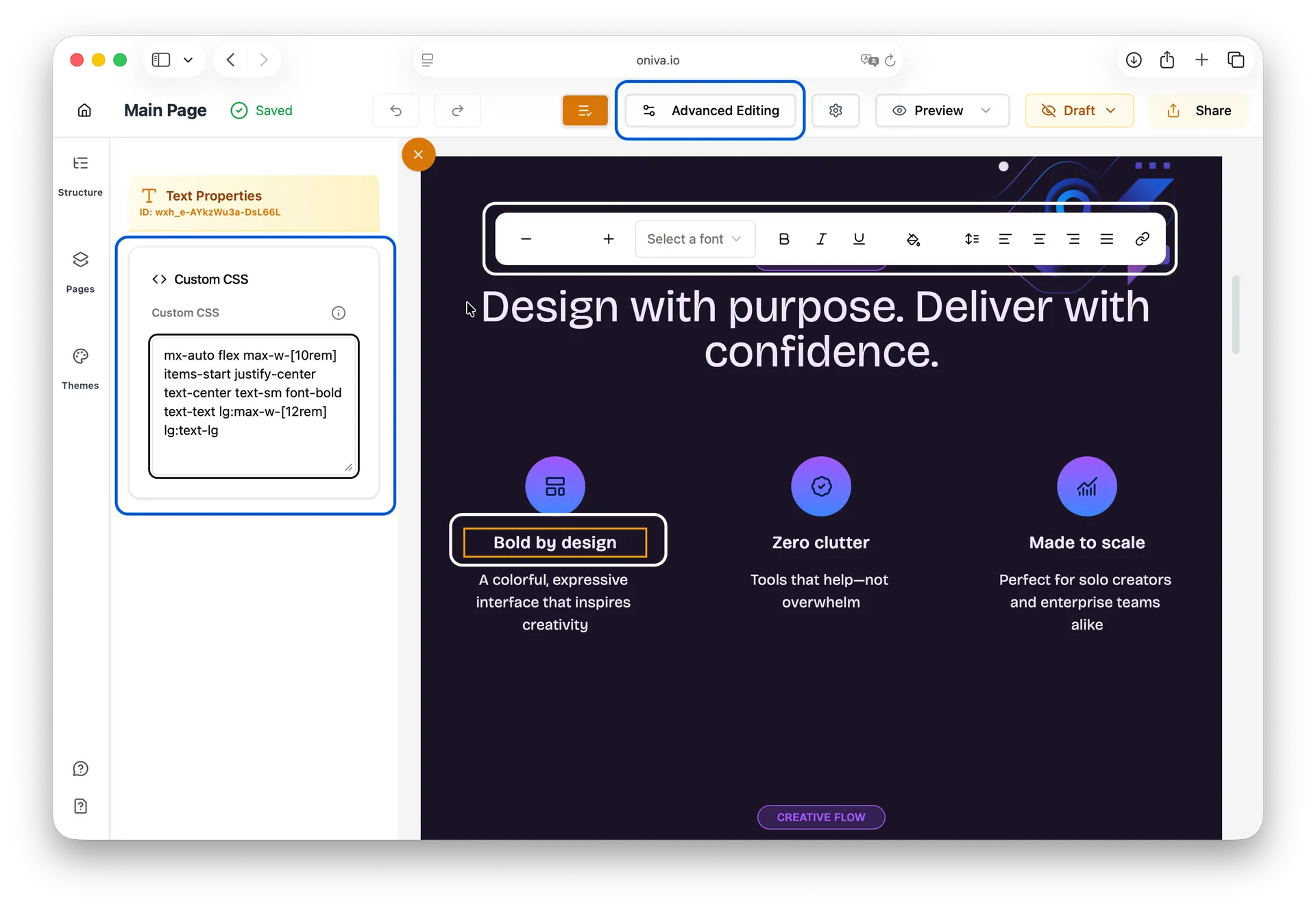
Advanced Editing Mode:
How to edit:
1. Click on the text element
2. Edit the text directly on screen with the toolbar (same as Easy mode)
3. A left side panel appears with a Custom CSS tab for advanced styling
Available panels:
- Custom CSS
Media Elements
Oniva.io supports the following media elements:
- Image
- Icon
- Embed
Note: The Embed element allows you to insert custom HTML, videos, forms, and other third-party content into your page.
Image:
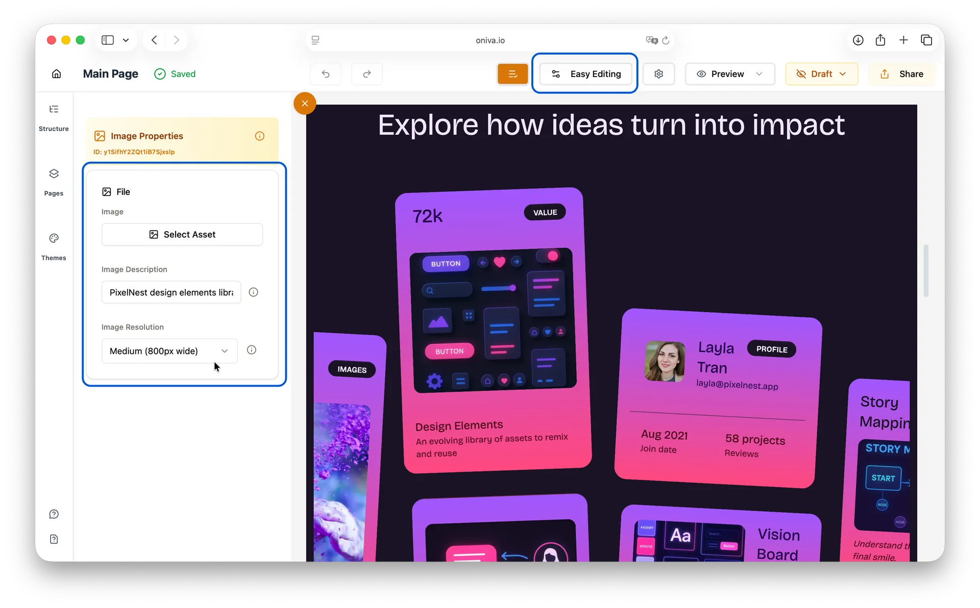
Easy Editing Mode:
How to edit:
1. Click on the image element
2. The left edit panel opens. Click Select Asset to upload a new image, choose one from your existing files or from Pexels.
3. Add or update the image description / alt text (important for accessibility and Search Engine Optimization - SEO).
4. Choose the image resolution. If you’re unsure what resolution to pick, click the info icon next to the resolution field for guidance.
Tip: To zoom in or zoom out, simply scroll your mouse wheel up or down while the image is selected.
Available panels:
- File Settings
Advanced Editing Mode:
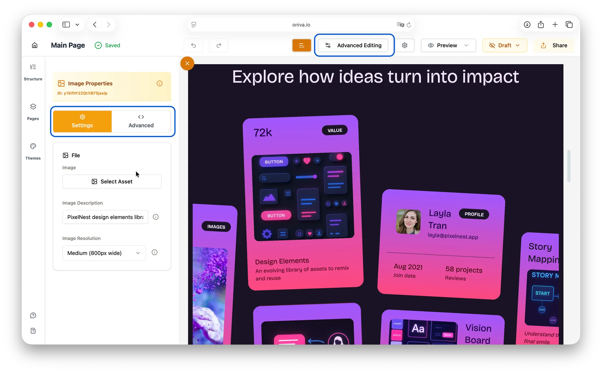
How to edit:
1. Click on the image element
2. The left edit panel opens. On Settings tab, click Select Asset to upload a new image or choose one from your existing files.
3. Add or update the image description / alt text (important for accessibility and Search Engine Optimization - SEO).
4. Choose the image resolution. If you’re unsure what resolution to pick, click the info icon next to the resolution field for guidance.
5. If you want to customize/add CSS classes, open the Advanced tab.
Available panels:
- Settings
- Advanced
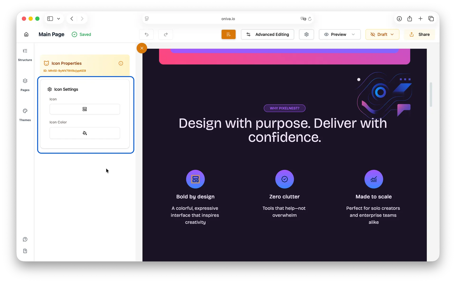
Icon:
How to edit:
The Icon element is the only one whose edit panel looks the same in both Easy Editing and Advanced Editing modes.
1. Click on the icon element
2. In the left panel, pick a new icon from the list.
3. By default, new icons use your theme’s primary color. To keep the original color, click Icon Color and then the trash icon to reset it.
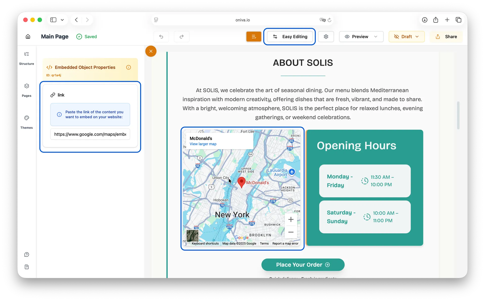
Embed:
Easy Editing Mode:
How to edit:
1. Click on the embed element
2. A left side panel opens
3. In the left panel paste the embed URL (e.g., YouTube iframe, Google Maps).
Available panels:
- Link Settings
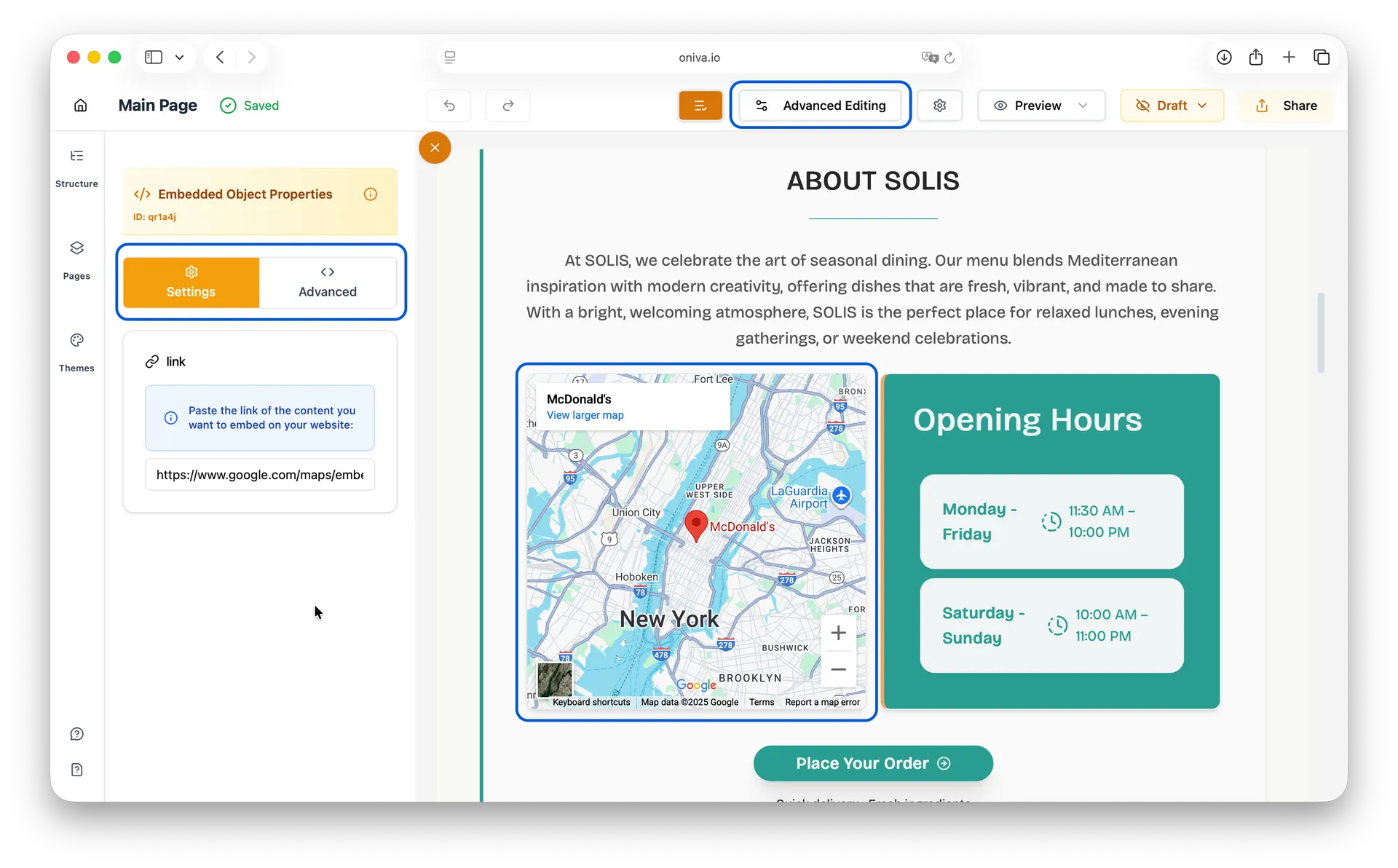
Advanced Editing Mode:
How to edit:
1. Click on the embed element
2. A left side panel opens
3. In the left panel, on Settings tab, paste the embed URL (e.g., YouTube iframe, Google Maps).
4. If you want to customize/add CSS classes, open the Advanced tab.
Available panels:
- Settings
- Advanced
Layout Elements
Oniva.io supports the following layout elements:
- Container
- Grid
- Card
- Section
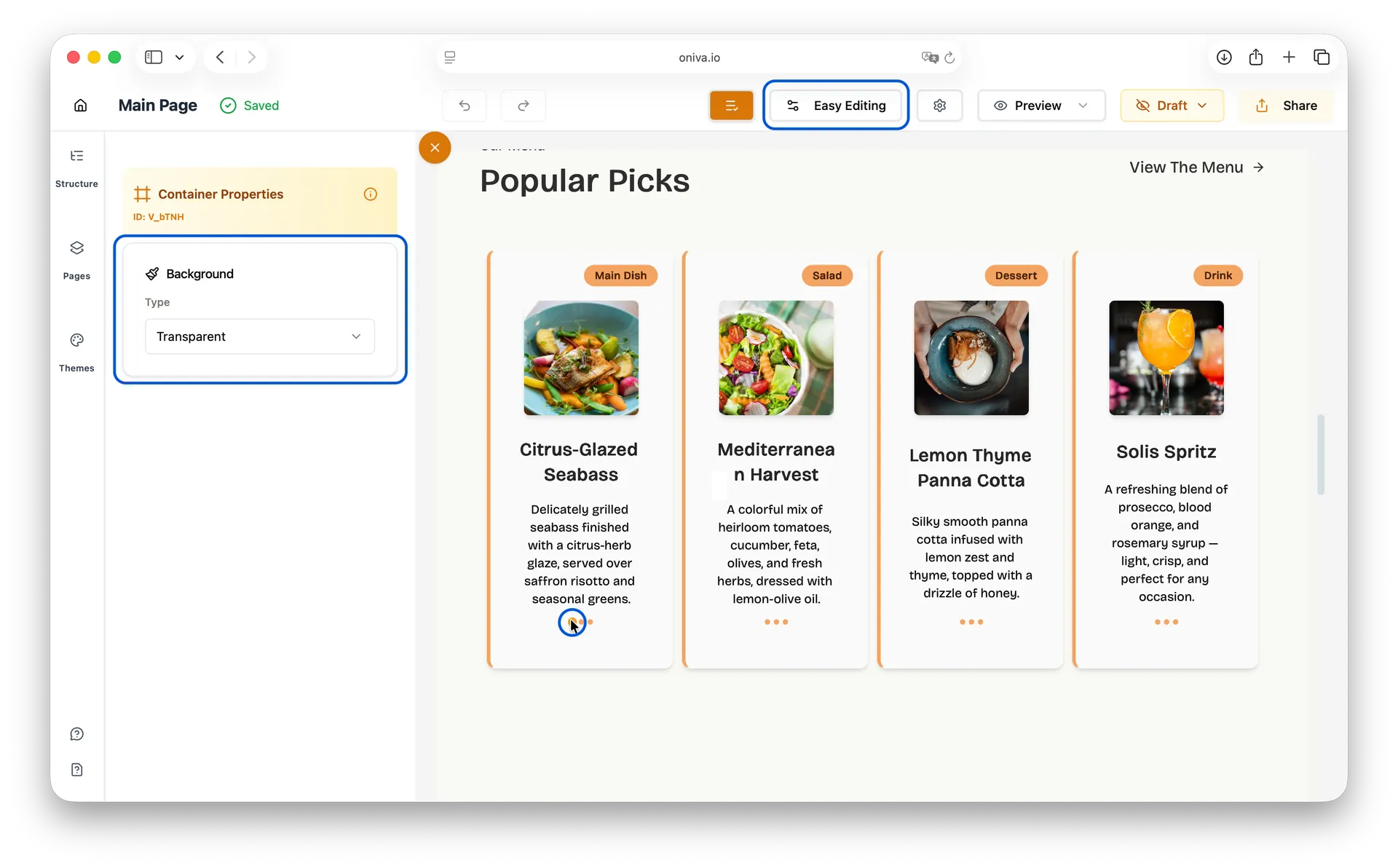
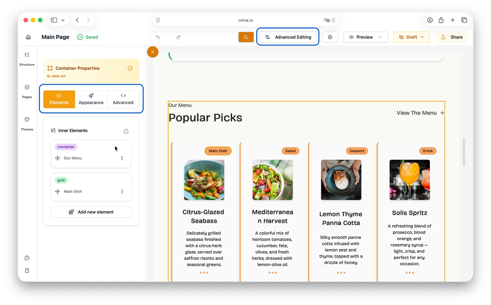
Container:
A container is a wrapper element that holds other elements and helps organize your page structure. It's useful for grouping content and controlling maximum width, centering content, and adding consistent spacing.
Easy Editing Mode:
How to edit:
1. Click on the container element
2. A left side panel opens
3. In the left panel, edit the container's background (type and color).
Available panels:
- Background
Containers in Easy Editing Mode:
You might notice that not all containers are clickable in Easy Editing mode. That's intentional! Most containers work behind the scenes to position your content, so we hide them to keep things simple. The containers you can edit in Easy mode are the decorative ones - those with visible backgrounds, borders, or colors that you might want to customize.
Advanced Editing Mode:
How to edit:
1. Click on the container element
2. A left side panel opens
3. Use the different tabs to customize your element:
- Appearance: edit the container's background (type and color).
- Elements: View and manage all elements inside this layout (like a tree structure of your content). You can duplicate existing elements or add new ones by clicking Add New Element.
- Advanced: Add or customize Tailwind CSS classes.
Available panels:
- Elements
- Appearance
- Advanced
Tip
The Elements tab is especially useful for complex layouts. You can click on any nested element in the tree to select and edit it without having to click on the canvas.
Grid:
A grid element creates a responsive column-based layout that automatically adjusts based on screen size. Perfect for displaying cards, images, or content in organized rows and columns. You can control the number of columns and spacing between items.
Easy Editing Mode:
How to edit:
1. Click on the grid element
2. A left side panel opens
3. Use the different tabs to customize your element:
- Elements: Manage items inside the grid - duplicate or create new elements while preserving responsive behavior
- Settings:
- Max number of columns: Controls how many items can appear next to each other in a row. For example, if you set it to 3, you'll see up to 3 items side by side. If you have 6 items, they'll be displayed in 2 rows of 3. On mobile devices, this automatically adjusts to 1 column for better readability.
- Spacing: Set vertical and horizontal spacing between grid items
Available panels:
- Elements
- Settings
Grid in Easy Mode:
Grid is the only layout element that shows the Elements tab in Easy Editing mode. This allows you to manage items inside the grid - duplicate existing elements or create new ones - while automatically preserving the layout and responsive behavior of your design. Other layout elements only show the Elements tab in Advanced mode.
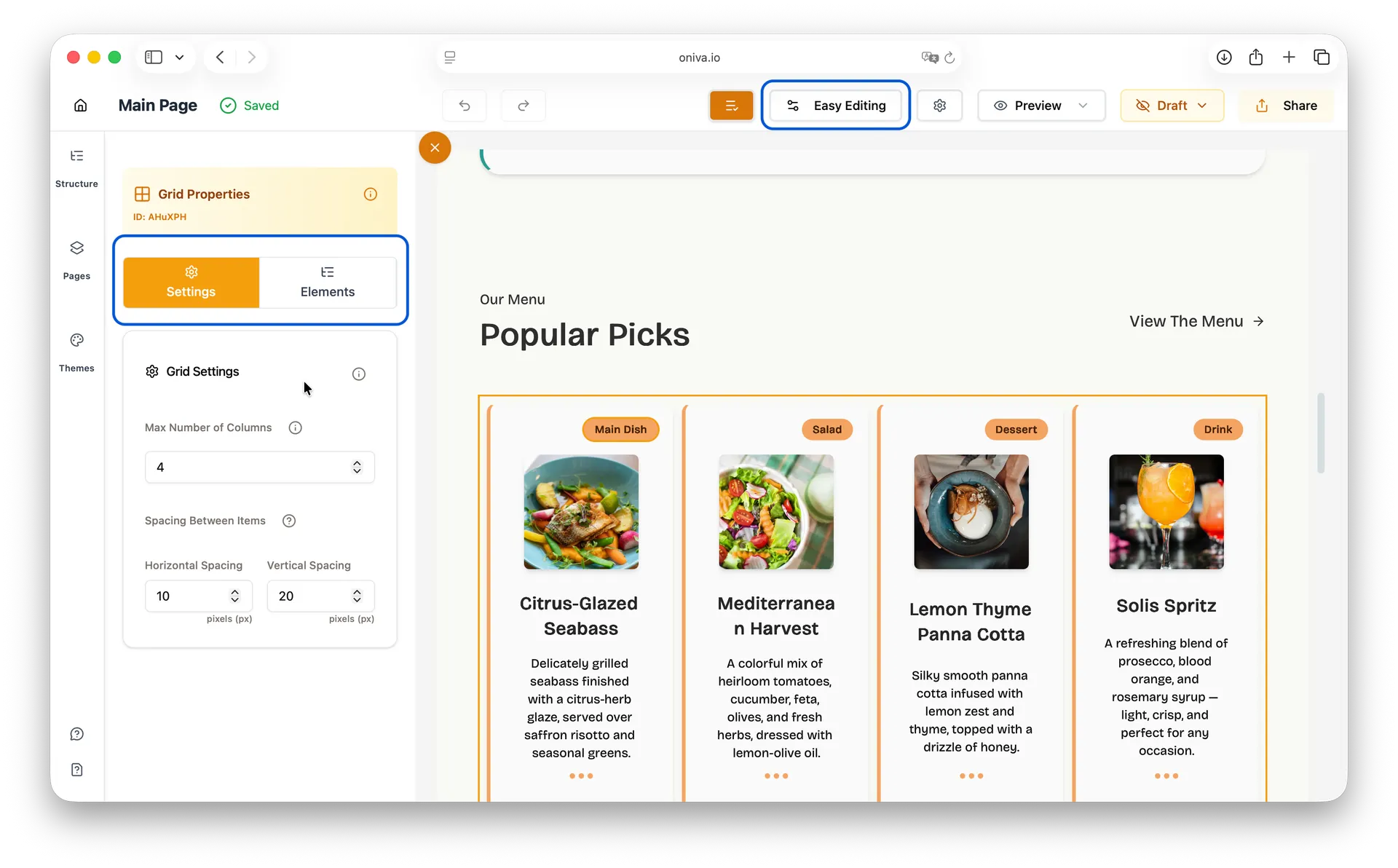
Advanced Editing Mode:
How to edit:
1. Click on the grid element
2. A left side panel opens
3. Use the different tabs to customize your element:
- Elements: Manage items inside the grid - duplicate or create new elements while preserving responsive behavior
- Settings:
- Max number of columns: Controls how many items can appear next to each other in a row. For example, if you set it to 3, you'll see up to 3 items side by side. If you have 6 items, they'll be displayed in 2 rows of 3. On mobile devices, this automatically adjusts to 1 column for better readability.
- Spacing: Set vertical and horizontal spacing between grid items
- Advanced: Add or customize Tailwind CSS classes.
Available panels:
- Elements
- Settings
- Advanced

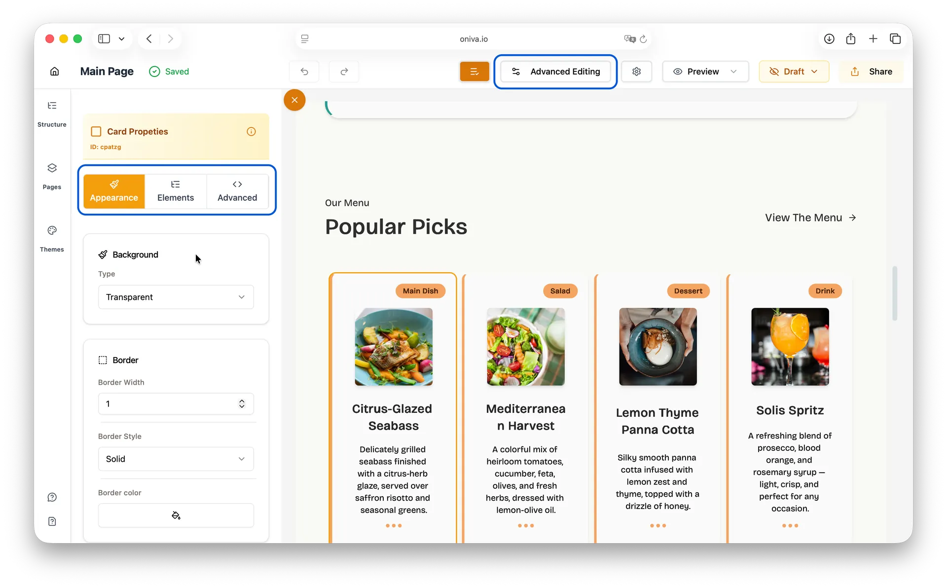
Card:
A card is a contained element with background, border, and padding that groups related information together. Cards are commonly used for products, team members, blog posts, or any content that benefits from being visually separated and contained.
Easy Editing Mode:
How to edit:
1. Click on the card element
2. A left side panel opens
3. In the left panel, edit the card's appearance - background, border, border radius and shadow.
Available panels:
- Appearance
Advanced Editing Mode:
How to edit:
1. Click on the card element
2. A left side panel opens
3. Use the different tabs to customize your element:
- Appearance: Edit the card's appearance - background, border, border radius and shadow.
- Elements: View and manage all elements inside this layout (like a tree structure of your content). You can duplicate existing elements or add new ones by clicking Add New Element.
- Advanced: Add or customize Tailwind CSS classes.
Available panels:
- Elements
- Appearance
- Advanced
Action Elements
Oniva.io supports the following action elements:
- Button
- Navigation Items
- Social Media
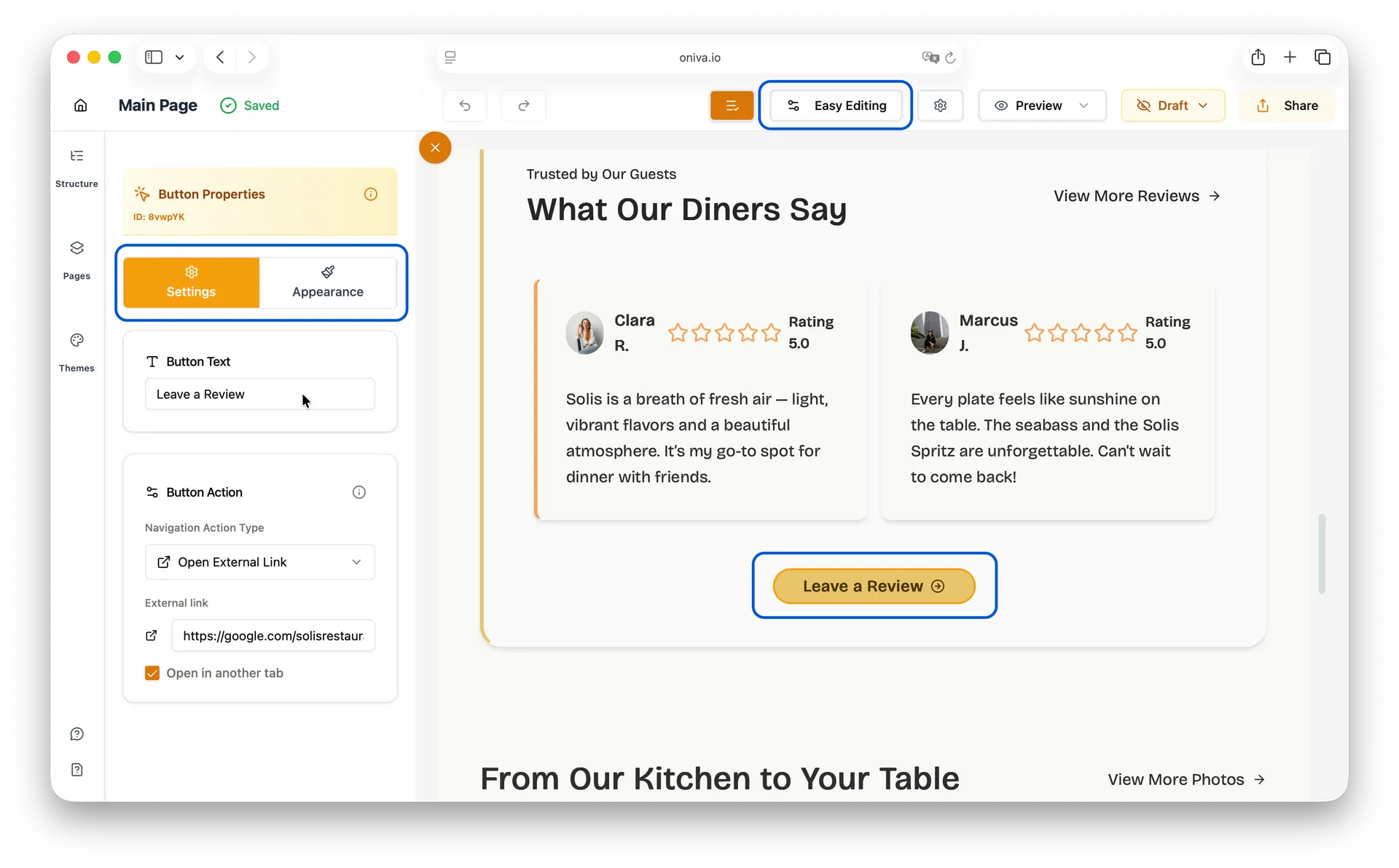
Button:
A button is a clickable element that triggers an action when users interact with it.
Easy Editing Mode:
How to edit:
1. Click on the button element
2. A left side panel opens
3. Use the different tabs to customize your element:
- Settings:
- Button text: the text that appears inside the button, usually your call-to-action.
- Action: every button needs an action — what happens when someone clicks it. In Oniva.io, you can choose to: scroll to a section on the same page, navigate to another page of your site, or open an external link in a new tab.
- Appearance: Edit the button's appearance - background, border and text color, and icon.
Available panels:
- Settings
- Appearance
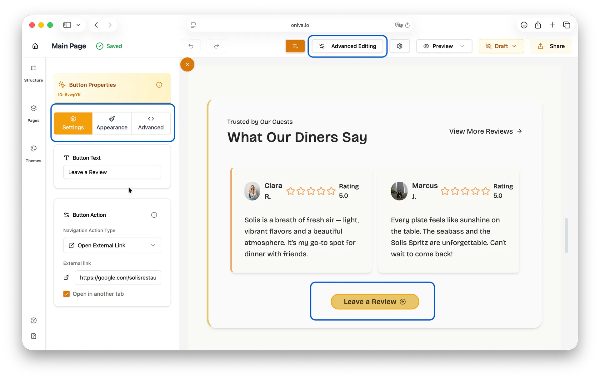
Advanced Editing Mode:
How to edit:
1. Click on the button element
2. A left side panel opens
3. Use the different tabs to customize your element:
- Settings:
- Button text: the text that appears inside the button, usually your call-to-action.
- Action: every button needs an action — what happens when someone clicks it. In Oniva.io, you can choose to: scroll to a section on the same page, navigate to another page of your site, or open an external link in a new tab.
- Appearance: Edit the button's appearance - background, border and text color, and icon.
- Advanced: Add or customize Tailwind CSS classes.
Available panels:
- Settings
- Appearance
- Advanced
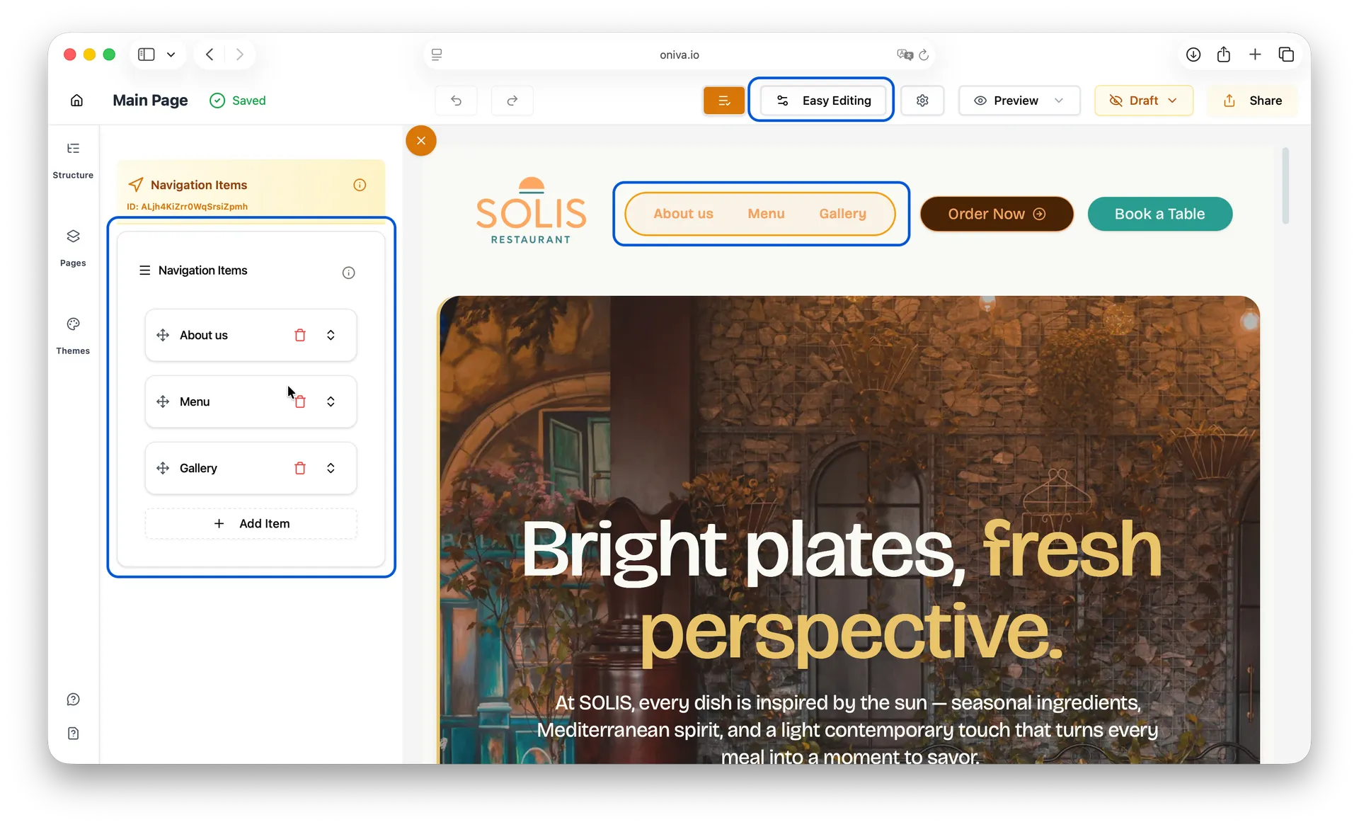
Navigation Items:
Navigation items are links used in menus and navigation bars to help users move through your website. They're typically grouped together to create site navigation.
Easy Editing Mode:
How to edit:
1. Click on the navigation items element — usually found in the website header and/or footer.
2. A left side panel opens
3. Click on the last icon of each navigation item to open the edit panel. From there, you can change the text and select the button action you want it to perform.
Tip: To reorder the navigation items, simply drag and drop them into the order you prefer.
Available panels:
- Navigation Items
Button Actions
The Button Actions is the action the element performs when clicked. It can be:
- Scroll to section: Smoothly scroll to a specific section on the same page
- Navigate to page: Go to another page on your website
- Open external link: Open a URL to an external website
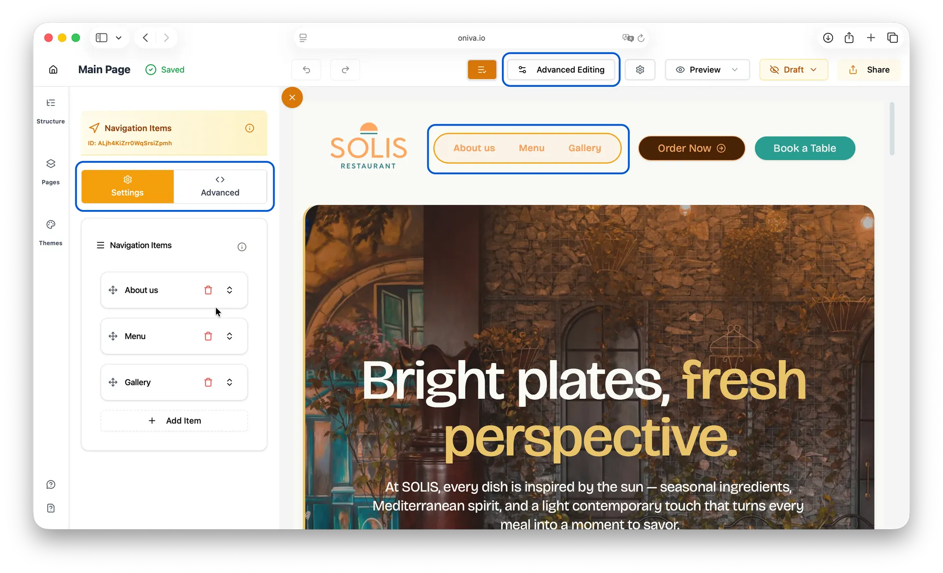
Advanced Editing Mode:
How to edit:
1. Click on the navigation items element — usually found in the website header and/or footer.
2. A left side panel opens
3. Click on the last icon of each navigation item to open the edit panel. From there, you can change the text and select the button action you want it to perform.
4. If you want to customize/add CSS classes, open the Advanced tab.
Available panels:
- Settings
- Advanced
CSS Classes
When you apply CSS classes in the Advanced tab of a Navigation Items element, these classes will be applied to all items inside the navigation menu.
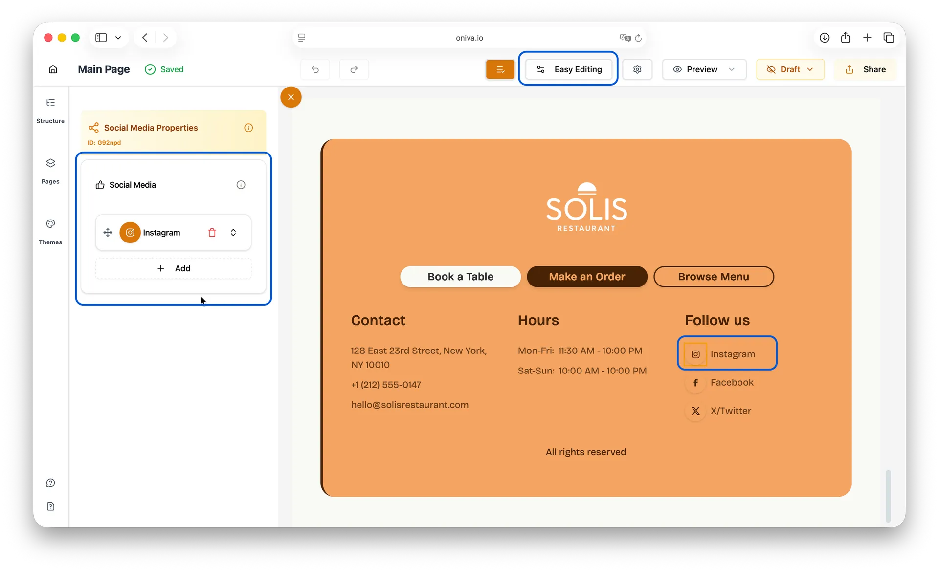
Social Media:
A social media element displays icons that link to your social media profiles (Facebook, Instagram, Twitter, LinkedIn, etc.). You can choose which social networks to display and customize their appearance.
Easy Editing Mode:
How to edit:
1. Click on the social media element — usually found in the footer (to display your official company profiles) or in sections where team members are introduced.
2. A left side panel opens
3. Click on the last icon of each social media button to open the edit panel. From there, you can change the platform, paste your social media URL, and customize both the button color and the icon color.
Tip: To reorder the social media buttons, simply drag and drop them into the order you prefer.
Available panels:
- Social Media
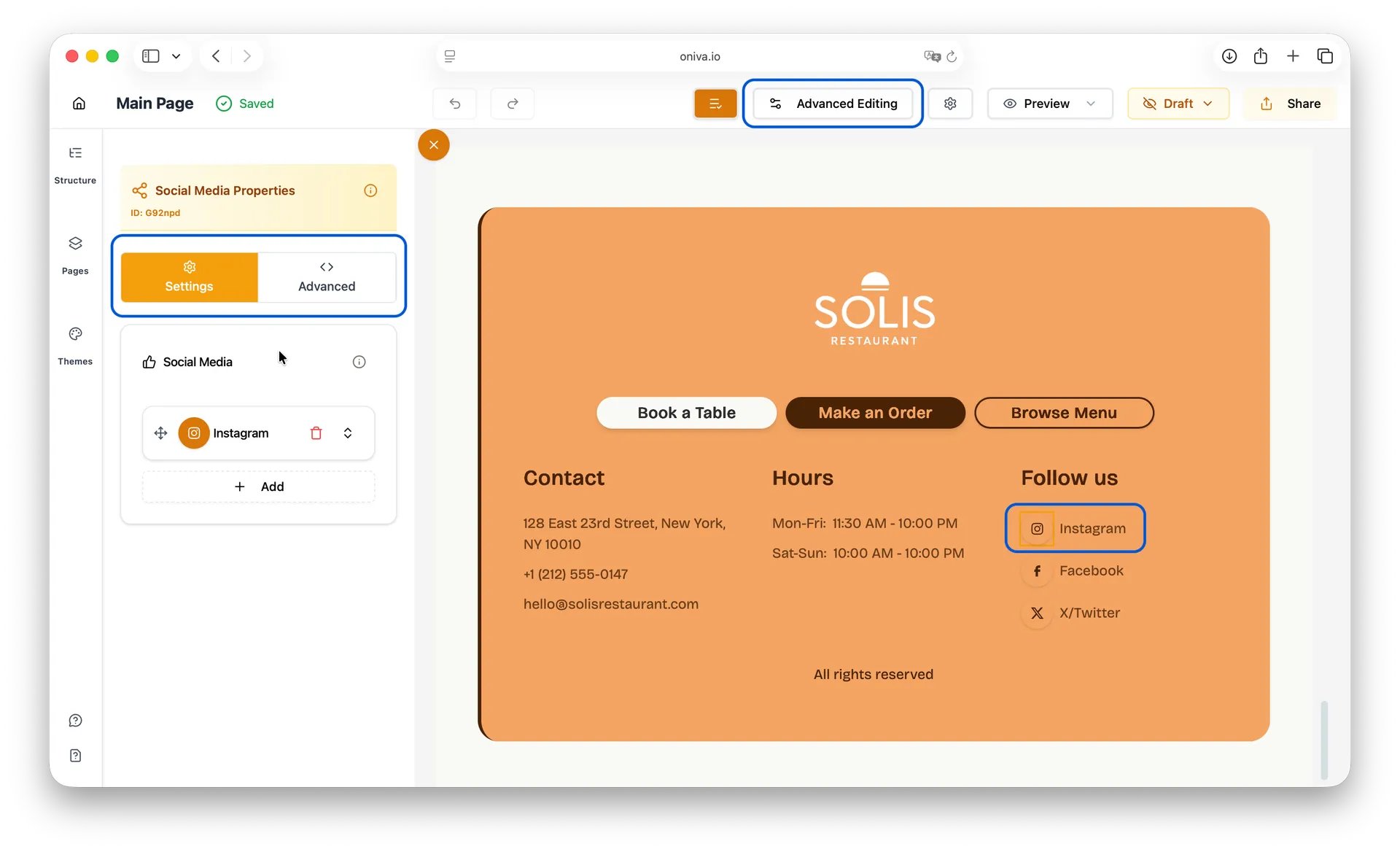
Advanced Editing Mode:
How to edit:
1. Click on the social media element — usually found in the footer (to display your official company profiles) or in sections where team members are introduced.
2. A left side panel opens
3. Click on the last icon of each social media button to open the edit panel. From there, you can change the platform, paste your social media URL, and customize both the button color and the icon color.
4. If you want to customize/add CSS classes, open the Advanced tab.
Available panels:
- Settings
- Advanced
CSS Classes:
When you apply CSS classes in the Advanced tab of a Social Media Items element, these classes will be applied to all items inside the social media menu.
Global Elements
Some elements are configured globally and appear across all pages of your website. These are the Header and Footer.
What Are Global Elements?
Header and Footer are special sections that appear consistently on every page of your website. When you edit them, the changes apply site-wide automatically.
Remember: Any edits to the Header or Footer will instantly apply to every page of your website. No matter which page you update them from, the changes will stay consistent across your entire site.
Editing the Footer:
The footer works like any other section - you edit each element inside it following the standard editing methods:
1. Click on any element within the footer (text, buttons, images, etc.)
2. Edit it according to its element type (see sections above)
3. Changes will automatically appear on all pages
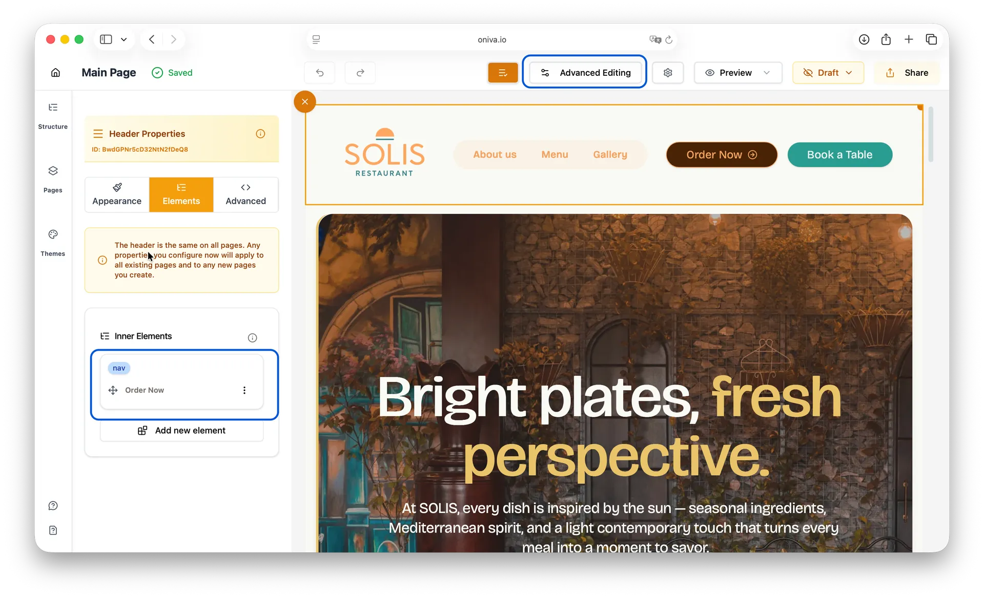
Editing the Header:
The header also works like a standard section where you edit individual elements. However, it includes a special configuration for mobile devices:
Configuring Mobile Menu:
How to access mobile menu settings:
1. Find the Header on your page
2. Click on the Navbar (nav) element inside the header
3. Look for the Mobile Variant settings in the left side panel
4. Choose your mobile menu variant:
- Sheet: Menu slides in from the left side, overlaying the content
- Drawer: Menu slides in from the bottom, overlaying the content
Tips to find the Navbar element:
1. Switch to Advanced Editing mode
2. Click on the header
3. Go to the Elements tab
4. Find the Navigation (navbar) element in the nested list
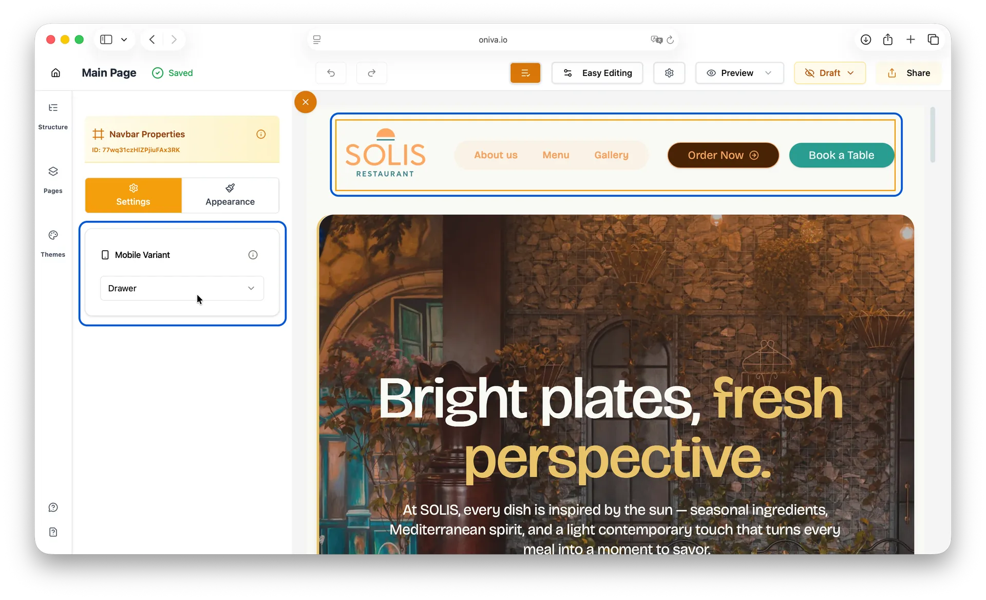
Tips for mobile menu:
- Preview your website on mobile/tablet to see how your choice looks
- The mobile menu automatically appears on smaller screens
- Your navigation items will be displayed vertically in the mobile menu